Trend Micro
Deep Security
1. Correlated Events
Interface & Widget
Project Overview
Deep Security was based on isolated modules which made it difficult for users to have a global awareness of all security events that happen across the protected infrastructure. There was a huge user need to have an interface that
would allow security admins to correlate distinct events and to display them graphically to quickly spot surges that might signify an ongoing security threat.
Our dashboard offered very little customization options, the default layout included a lot of widgets that most customers didn't need and the remaining widgets didn't actually display the information that users wanted to visualize.
We performed competitors analysis and user interviews to suggest quick fixes to the product as well as conceive vision designs to implement a new correlated events analysis interface.
Competitors Analysis
Our product team had previously analyzed the products of main competitors like Symantec and McAfee so I focused on analyzing other cyber security products that, although smaller, had quite interesting dashboards and overall UI features.
This allowed us to have an even more comprehensive view of what kind of improvements our own product could undergo in order to remain competitive alongside our competitors.
ESET Endpoint Security
Remote Administrator
Remote Administrator
Pros
Highly customizable widgets that allow a huge amount of parameters to be combined into widgets. Good depiction of advanced functionalities through the use of icons on the headers of the widgets.
Cons
The degree of customization of the widgets may prove overwhelming for inexperienced users. The dashboard should serve as a quick overview of the user's environment, this dashboard is too heavy and the information is too dense.
This analysis is based on the following video:
https://www.youtube.com/watch?v=MKH85zPoG1MThe ESET widgets are created by combining different sets of metrics and are highly customizable.
At 10:10 you can see an overview of the "Reporting" section that is used to generate reports and widgets for the dashboard. While the high degree of customization may seem like a plus, the amount of options given to the user is in fact quite overwhelming and may frustrate users that want to quickly have a quick overview of their environment.
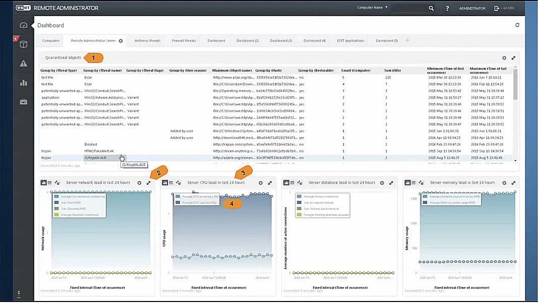
1. Quarantined Objects List
This list widget occupies an excessive amount of viewport space and displays too much information.
Since there are detailed pages where the user can find this information it makes no sense to offer it from the dashboard screen which is intended for a quick visual overview of the most important metrics.
2. Widget Controls (Customization / Resize)
The icons clearly indicate to the user that he can customize the parameters of the data shown on the widget and resize it.
3. Date Range Indicator
It's good to have the date range mentioned on the title of the widget since it helps the user to quickly see the time span displayed on the graph. This information is especially important to display if you allow users to select different time ranges for different widgets. However if the dashboard's data is based on a single time range that affects all widgets adding this information can be unnecessary but the range selected should be highly visible to the user somewhere else on the page.
4. Caption Overlay
These type of captions should be avoided as they may overlap the graphs displayed under them and are difficult to read by users with low visual acuity.
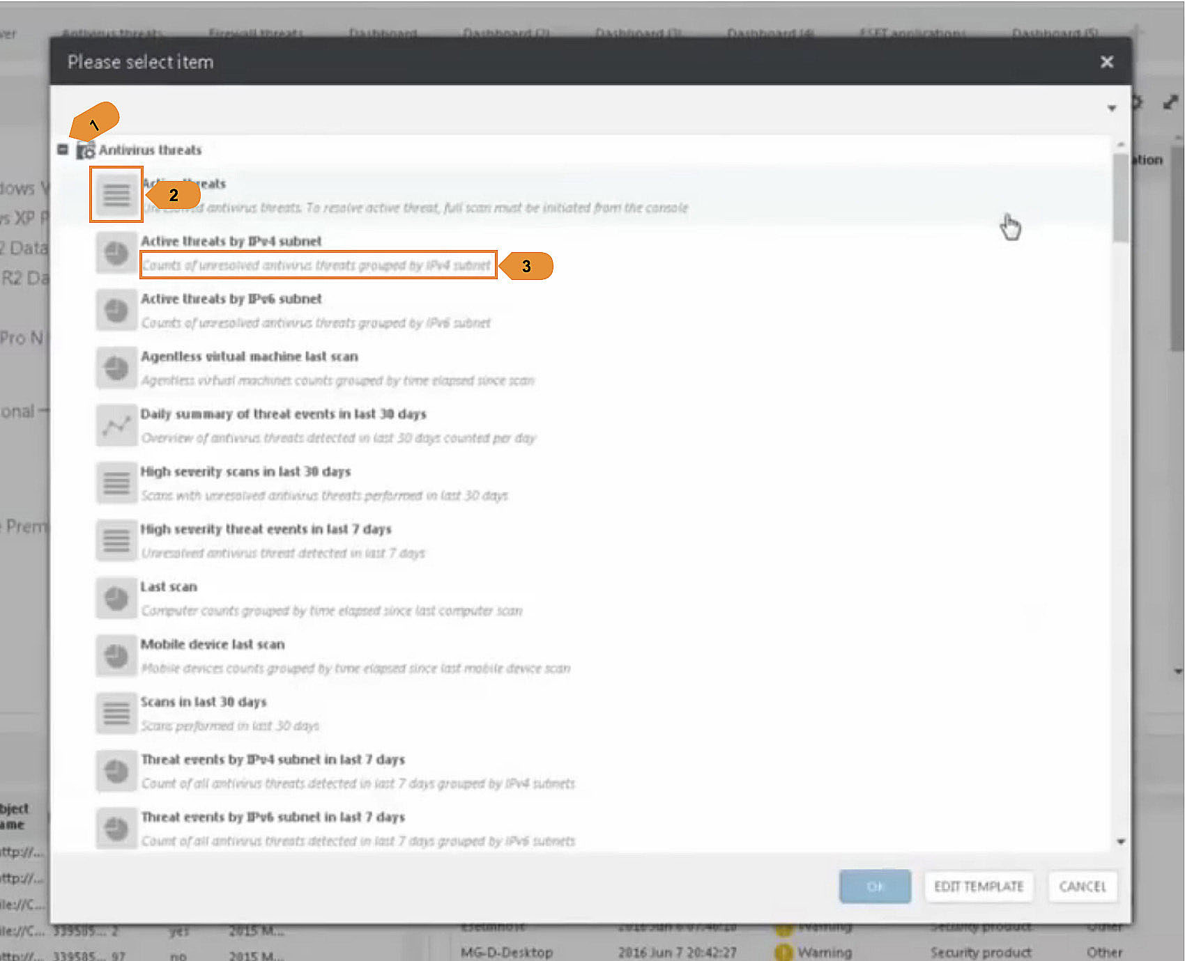
1. Widget Grouping
This allows the user to have an overview of the different groups of widgets available by module before drilling down within a specific group to select an individual widget. It widely increases usability and we should consider doing the same.
2. Widget Type Thumbnail
This quickly allows the user to see what type of visualization the given widget will have (pie chart, graph or list).
3. Widget Description
A description can help the user know what type of data a particular widget will display however in this dashboard some of the descriptions offer no added value, for e.g: "Scans in last 30 days" / "Scans performed in last 30 days". In these cases it would be better to simply omit the description.
Again, a live preview of the actual widget might solve this user need better than both this description and the aforementioned "Graph Type Icon"
Sophos
Security Central
Security Central
Pros
Mobile-friendly layout. Clean design and good color scheme. Interesting mix of metrics and tools widgets.
Cons
The General Dashboard can't be customized at all and while on the Mobile Dashboard the widgets can be rearranged that behavior is not immediately perceptible.
Mobile-friendly layout. Clean design and good color scheme. Interesting mix of metrics and tools widgets.
Cons
The General Dashboard can't be customized at all and while on the Mobile Dashboard the widgets can be rearranged that behavior is not immediately perceptible.
The Sophos Security Central is divided in a General Dashboard that contains general
information about the state of all your protected servers and other platform specific dashboards. One example of such dashboards is the Mobile Dashboard which deals only with endpoint security metrics for protected mobile devices within your network.
General Dashboard
information about the state of all your protected servers and other platform specific dashboards. One example of such dashboards is the Mobile Dashboard which deals only with endpoint security metrics for protected mobile devices within your network.
General Dashboard
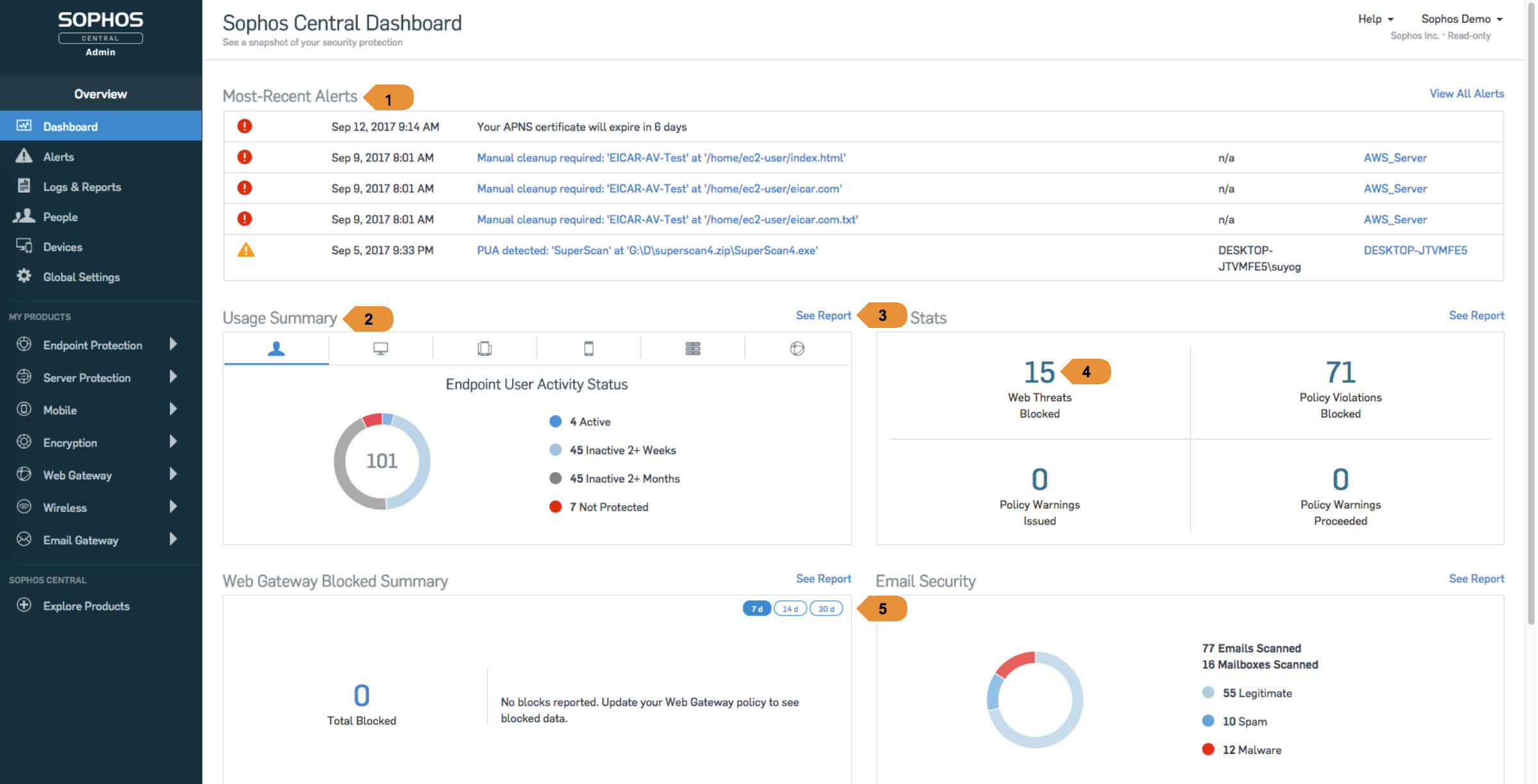
1. "Most-Recent Alerts" box displaying five entries
The full-width widget can accommodate long descriptions and paths without resorting to truncation, this provides a better user experience than relying on mouse hovering and tooltips to show the complete paths. Still this widget occupies one third of the viewport's vertical space reducing quite considerably the visibility of the other widgets.
2. "Usage Summary" providing the user with six tabs through which he/she can get more information on different security modules
This type of tabbed widget provides the user with an overview about different security aspects without occupying too much space on the dashboard however the icons alone are not sufficient for the user to know what the tabs correspond to. It would increase usability considerably to add clear and visible text labels as well.
3. "See Report" links allow the user to access detailed information about a security metric displayed on a particular widget.
The links are quite visible and displayed always on the same location in relation to the widget. This provides the user with a constant, easily recognizable interface pattern. On the other hand positioning these links on the rightmost edge of the widget dissociates them from the title of the particular widget. They could be positioned right next to the widget's title to provide a better reading flow.
4. "Web Stats" widget providing web threat information
There is no clear indication of the date range used to display these results. The user needs to click the "See Report" button to realize that they're based on the last 90 days.
5. Date Range Selector
The date range selector on the top right corner of this widget provides the user wth a quick way to change the results displayed but it would be great to further customize the time range shown.
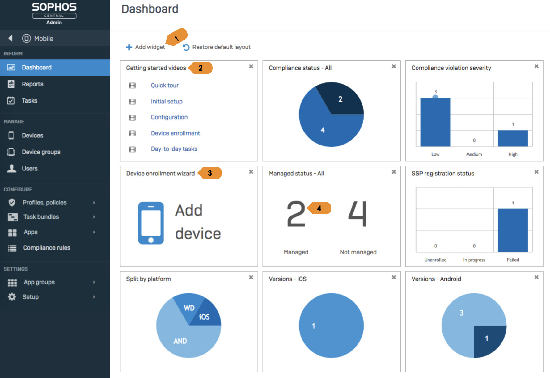
1. Add Widget Button
The button is positioned in a very visible area of the screen so it's easily spotted by the user unlike the button on our current Deep Security dashboard.
2/3. Tutorial / Utility Widgets
This is a great example of a dashboard that mixes data analysis widgets with operational widgets. The "getting started" widget also provides a first time dashboard user with detailed information about available features. There could be however a better visual distinction between widgets that display metrics and operational ones.
4. Managed Status Widget
There should be a stronger color indicator to distinguish the "managed" from the "not managed" devices.
User Interviews
We organized internal interviews with our Managed Services team that uses the Deep Security product to provide cybersecurity solutions to some of our corporate customers. They are some of Deep Security's most knowledgeable users and
were an amazing source of feedback regarding what aspects of our product we should focus our improvements on.
A total of 10 interviews were conducted, the results of 2 of them are presented below.
A total of 10 interviews were conducted, the results of 2 of them are presented below.
Chen F.
Roll-Out Manager
Roll-Out Manager
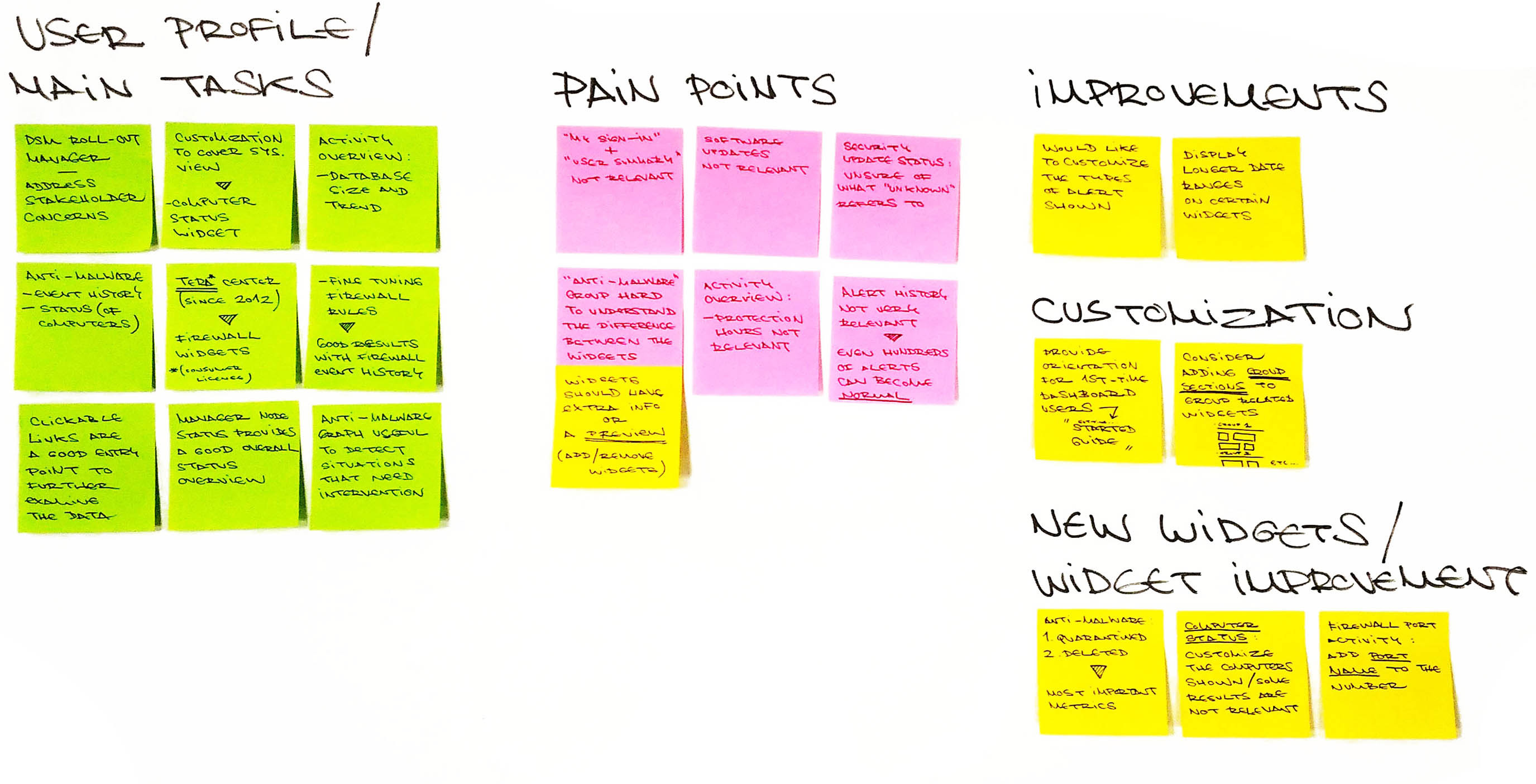
Add/Remove Widgets
Issue
When adding new widgets to the dashboard it is difficult to have an idea of what kind of metrics some of them will display.
When adding new widgets to the dashboard it is difficult to have an idea of what kind of metrics some of them will display.
Improvement
Display a visual preview of each widget when the user mouses over them on the "Add/Remove Widgets" list.
This could be a live preview if the loading time to display it is acceptable or simply a static image with an example of the widget with dummy data.
There could also be a text description displaying additional information.
Issue
After adding new features it's hard to see what group they used to belong to.
After adding new features it's hard to see what group they used to belong to.
Improvement
Widgets could be grouped on the dashboard in expandable/collapsible sections based on the same groups that they show under on the "Add/Remove Widgets" dialog.
Widgets could be grouped on the dashboard in expandable/collapsible sections based on the same groups that they show under on the "Add/Remove Widgets" dialog.
My User Summary
Issue
User feels that the information displayed on this widget is not relevant.
User feels that the information displayed on this widget is not relevant.
Improvement
Consider deleting the widget or removing it from the default dashboard.
Consider deleting the widget or removing it from the default dashboard.
Security Update Status
Issue
User is unsure of what the value "Unknown" refers to.
User is unsure of what the value "Unknown" refers to.
Improvement
Add tooltips to display additional information about the different values.
Add tooltips to display additional information about the different values.
Activity Overview
Issue
User feels that "Protection Hours" is not a relevant metric but would like to know more information regarding "Database Size"
User feels that "Protection Hours" is not a relevant metric but would like to know more information regarding "Database Size"
Improvement
Revise the information hierarchy of the "Activity Overview" widget or allow further customization.
Revise the information hierarchy of the "Activity Overview" widget or allow further customization.
Philip M.
Managed Services
Managed Services
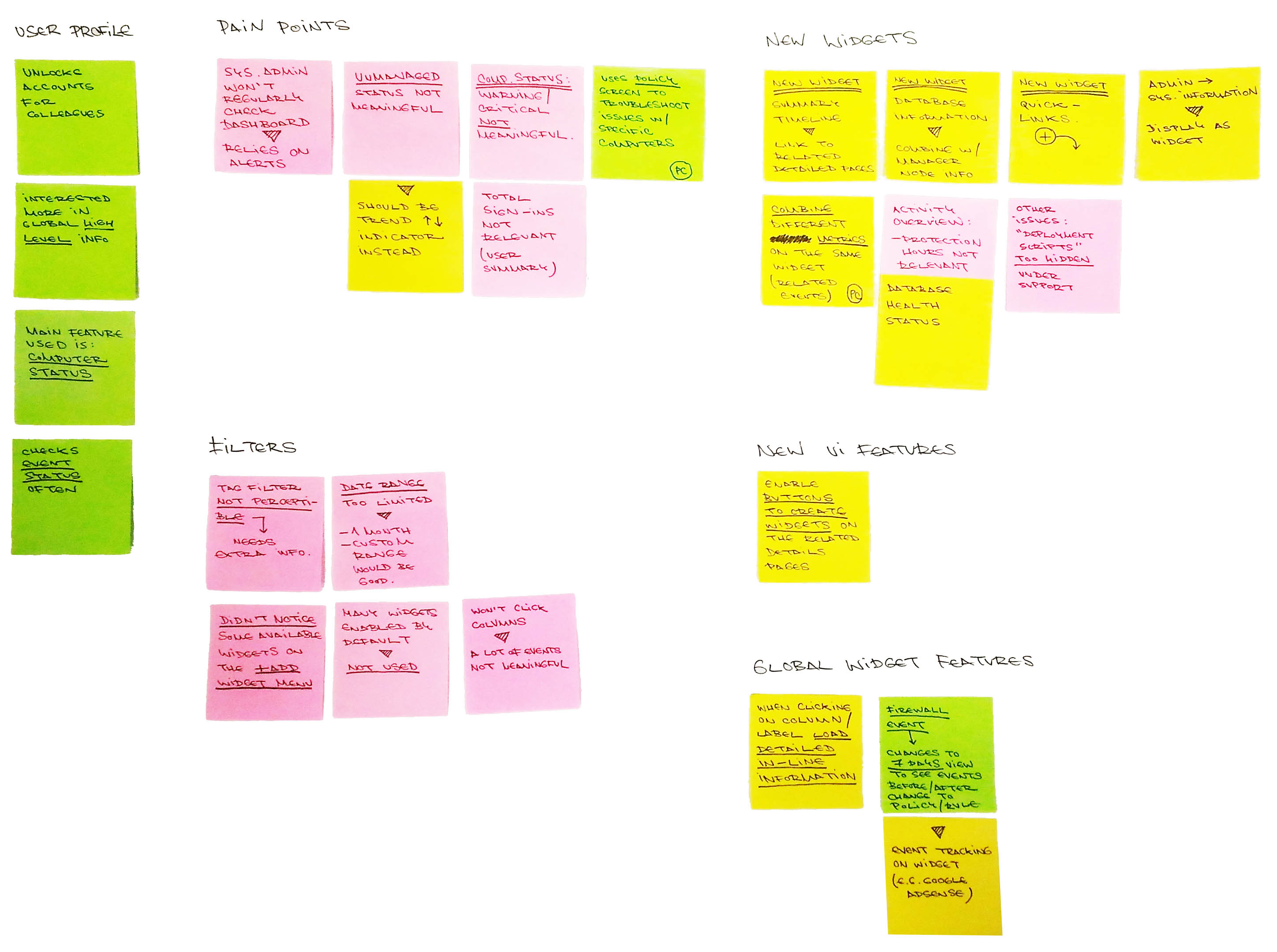
Add/Remove Widgets
Issue
Not aware of all the available widgets.
Never used the "Add/Remove Widgets" button to configure his dashboard.
Not aware of all the available widgets.
Never used the "Add/Remove Widgets" button to configure his dashboard.
Improvement
Two features that would help tackle this issue are:
Moving the "Add/Remove" button to a more visible location (for e.g. on the top left corner of the page)
Changing the user flow to the following:
1. User first logs in to the DSM.
2. User is presented with a "Getting started" screen similar to the "Add new dashboard" dialog.
3. The user can choose from two options:
A. Start with an empty dashboard
B. Start with a dashboard template:
- Basic User Dashboard
- Other Templates
4. If the user selects the empty dashboard he/she can then configure it with whatever widgets he would like. The user needs to be shown that there is this customization possibility the first time he/she enters this section.
Custom Widgets
Issue
A lot of the widgets on the "Default" dashboard are not very useful.
A lot of the widgets on the "Default" dashboard are not very useful.
Improvement
Functionality to review the widgets that are being added to the "Default" dashboard or simply give the user the ability to start with an empty dashboard and customize the widgets they want to see added to it.
Functionality to review the widgets that are being added to the "Default" dashboard or simply give the user the ability to start with an empty dashboard and customize the widgets they want to see added to it.
Date Filter
Issue
Current date ranges not sufficient.
Current date ranges not sufficient.
Improvement
Add additional options:
- 1 month
- Custom range
Add additional options:
- 1 month
- Custom range
Computer Status
Issue
"Critical / Warning" events under "Computer status" are not meaningful. "Managed / Unmanaged" values in absolute numbers are not relevant.
"Critical / Warning" events under "Computer status" are not meaningful. "Managed / Unmanaged" values in absolute numbers are not relevant.
Improvement
Allow users to filter what types of "Critical / Warning" events they would like to see displayed on this widget.
Display "Managed / Unmanaged" values as a trend indicator rather than an absolute number.
Allow users to filter what types of "Critical / Warning" events they would like to see displayed on this widget.
Display "Managed / Unmanaged" values as a trend indicator rather than an absolute number.
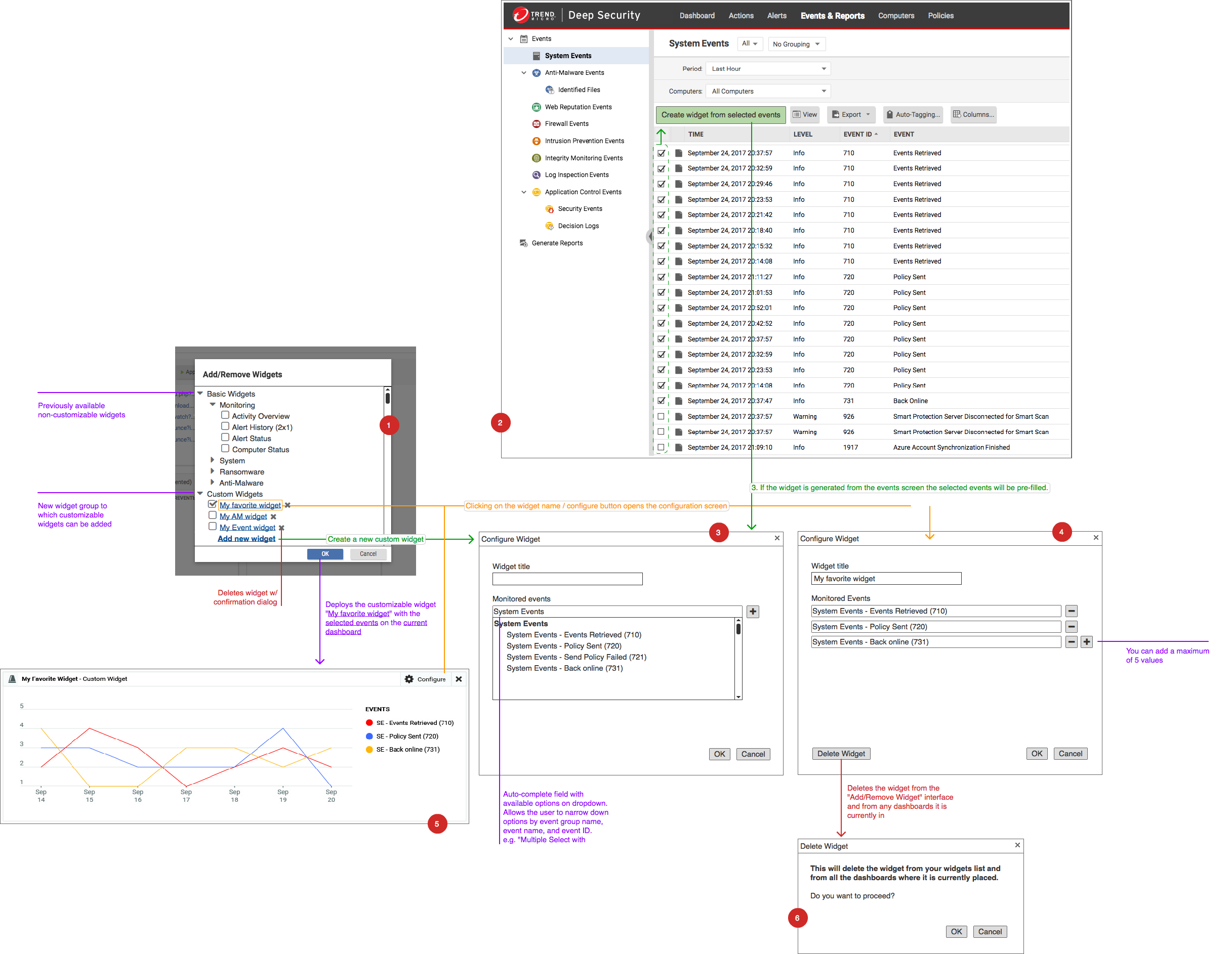
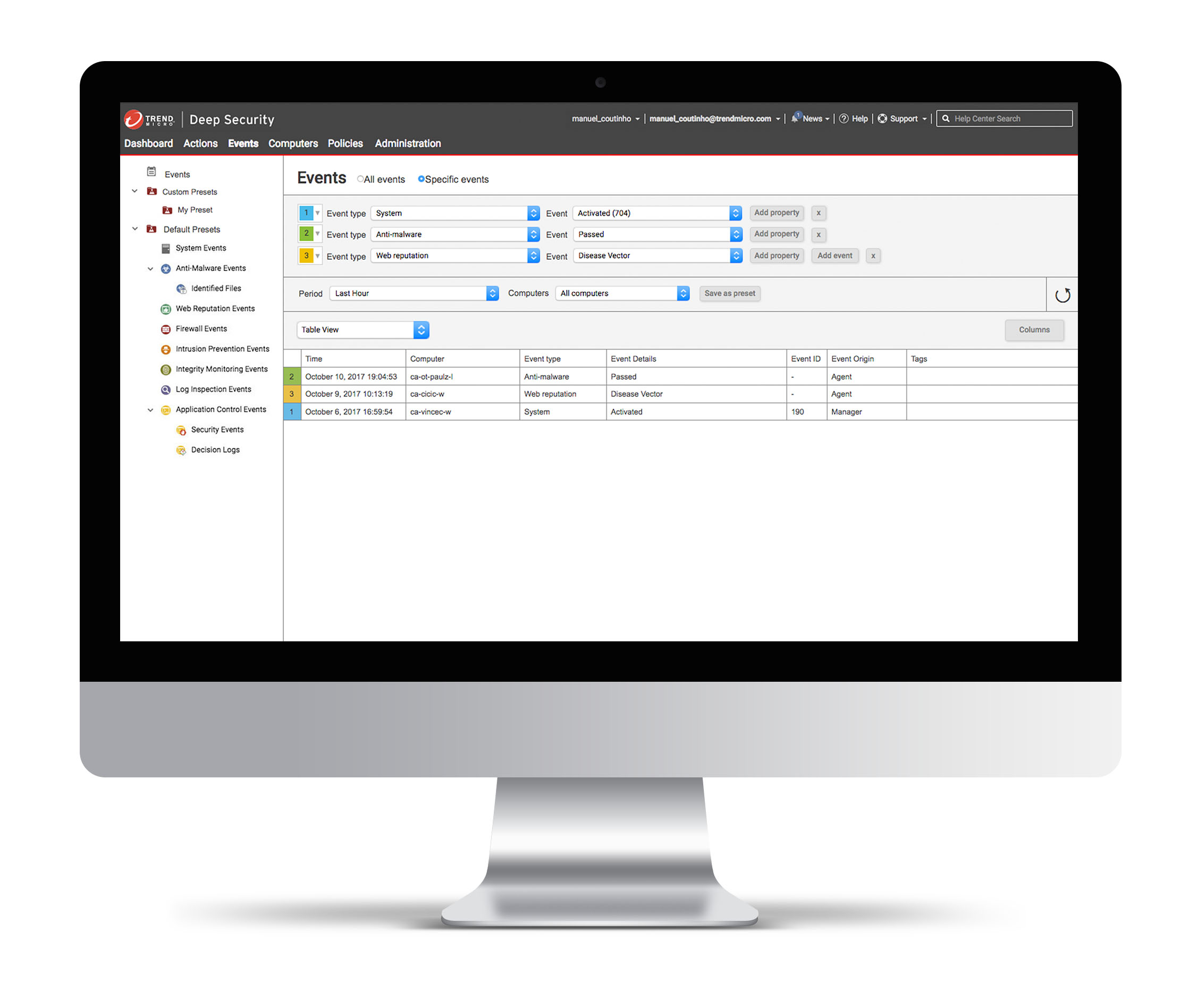
User Flow Diagram
We quickly spotted a huge user need to create widgets that simultaneously displayed different event occurrences on one single widget.
To accomplish this the current list of widgets would have to be split into two groups:
1. The widgets that our product currently supported under a "Basic Widgets" section
2. The newly conceived customizable widgets grouped under a "Custom Widgets" section
These custom widgets could be created from the "Add/Remove Widgets" screen or directly from a list of "Events".
To have a better understanding of the what would be required in order to create these Correlated System Events Widgets we created an user flow diagram.
Design
Event Correlation
Correlate events from different modules to quickly lock in on threats
Advanced Filtering Rules
Narrow the events displayed and quickly focus on those that are important for your role
Filter Presets (Save/Load Queries)
Save a query logic to regularly keep track of specific events
Advanced Graphical Event Visualization
Visualize queries with the visual representation of your choice (table, column graph, line graph)
Instant Dashboard Widget Creation
Generate widgets with the settings selected and add them to your dashboard in order to have a detailed summary of the protection status of your environment at a glance.
2. Application Control
Range Selector
Project Overview
Users were struggling to quickly scan events and to narrow the time range displayed in order to zoom in on surges of events that normally signify a threat.
This analysis is crucial to perform cyber security forensics and to understand how clusters of computers can become threatened by trojans and exploits.
This project's objective was to create a reusable drilldown graph component that could be used throughout the product and would initially be implemented on the Application Control interface.
Functional Requirements
Max Range
The "Max Range" drop down selector allows the user to select the full range of the graph shown below it.
It contains the following options:
1. Last 24 Hours (Bottom Level)
2. Last 30 Days
3. Last 12 Months
All of these options include the current hour, day and month as the initial series and count backwards to the period that preceded it. An additional option "Custom" is added to the list and selected when the user drills down through one of the series shown on the graph.
Selected Range
The "Selected Range" defines a date range based on the "Range Selector" and is automatically updated when the "Range Selector" is moved. Reversely the user can select a specific date on the "Selected Range" selectors in order
to narrow or expand the selection and trigger the movement of the "Range Selector" below. he range selectors vary according to the type of "Max Range" shown:
Max Range
Last 24 Hours
Last 24 Hours
Selector Type
Dropdown
Dropdown
Values
24:00 format time values.
Hourly intervals.
24:00 format time values.
Hourly intervals.
Last 30 Days
Day Picker
Grid of days.
No month based navigation.
All of the days not included in the range will be greyed out and can't be selected.
No month based navigation.
All of the days not included in the range will be greyed out and can't be selected.
Last 12 Months
Dropdown
Months' names.
Range Selector
The "Range Selector" can be moved manually by clicking and holding the mouse button over it's draggable area. The width of the "Range Selector" equals the full space between the columns to its left and right and its height
equals the full height of the graph. The range selector snaps immediately to the gap closer to it while it's being dragged and remains in that space when the mouse button is released.
Prototype
Drilldown through the three different available time ranges.
Drill down starting with the pre-defined "Max Range" value of "Last 12 Months".

The user drills down by clicking the item "Nov 2017" to a "Custom" selected "Max Range" view of November.

From there the user chooses to drill down by clicking on the item "15th of November" and the graph refreshes to show him the full day.

The user can then mouse over the displayed items to get additional information although he/she won't be able to drill down any further as the hourly scale is the lowest one possible. On this screen (or any of the others) the user can also use the range selector to narrow down the "Max Range" to a particular "Selected Range" of results.
Implementation on Application Control
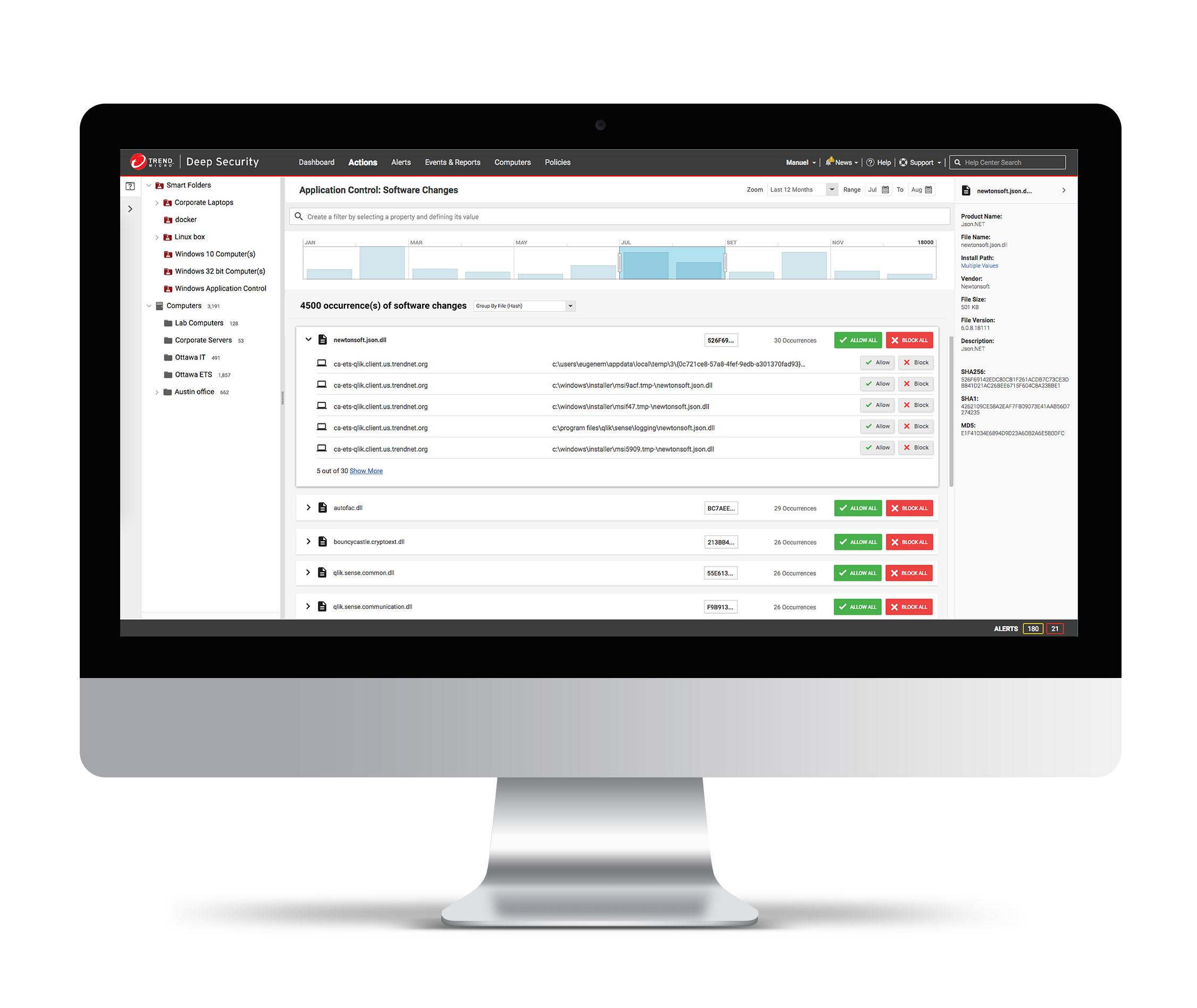
In this example you can see the event display graph applied to the Application Control: Software Changes page.
The user can drag the handles to expand or decrease the range of events shown and also drill down to further limit the results displayed.
This time based control can be used in sync with the smart folder/computers selection and advanced filtering criteria to narrow down on relevant results for forensic analysis of threats stored on the Deep Security manager.
3. Vulnerability Scan
Reporting Interface
Project Overview
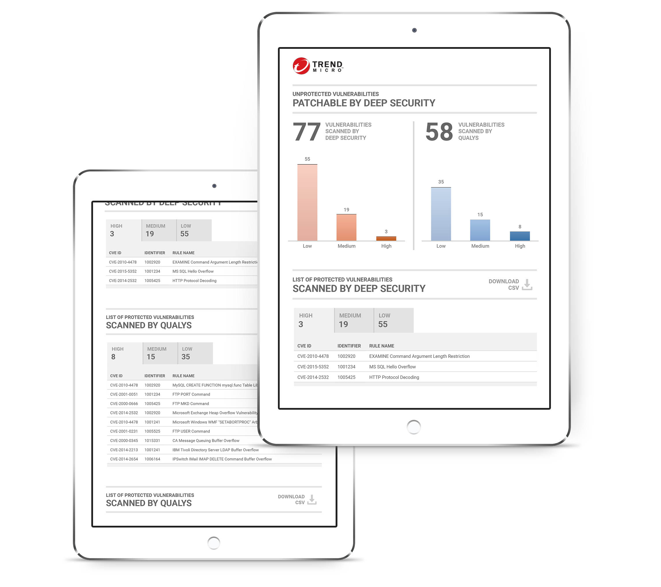
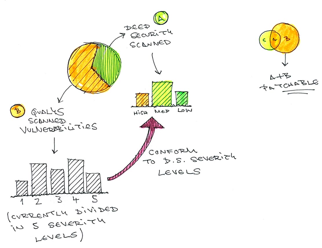
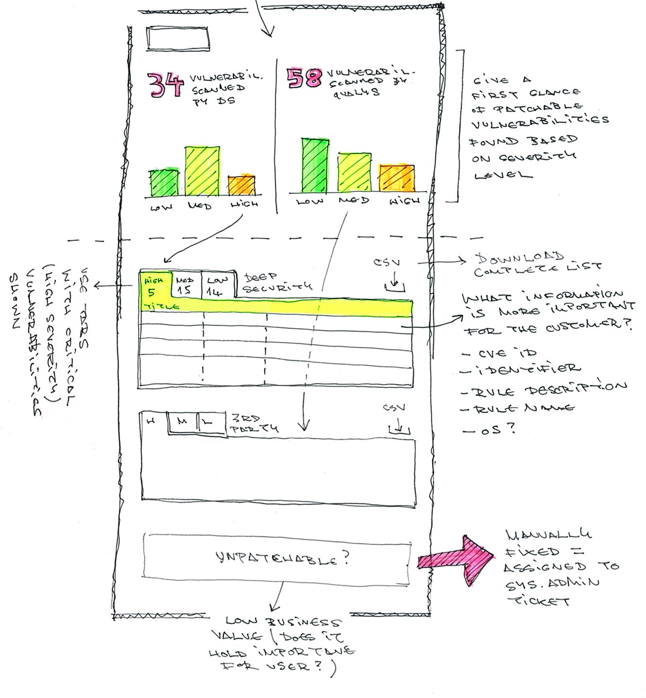
The objective of the reporting interface was to provide customers with a list of vulnerabilities scanned by Deep Security and other 3rd-party scanners (for e.g. Qualys) that could be patched by Deep Security.
We also needed to provide customers with a list of vulnerabilities that couldn't currently be patched although this information had less business value.
We also needed to provide customers with a list of vulnerabilities that couldn't currently be patched although this information had less business value.
Affinity Diagram
This affinity diagram helped us devise the key metrics that needed to be visualized and to cluster them into groups based on their natural relationships.

Ideation
First we thought about representing the vulnerabilities scanned by Deep Security vs. those scanned by a third-party tool in the form of a pie chart but we ended up realizing this would be a misleading way of doing so.
In the end we ended up going for a simple numeric depiction of the vulnerabilities found and to place them side by side for comparison. We complemented that element with a column graph that gives the customer a first glance of amount of vulnerabilities based on three severity levels.
Below you have more detailed information for each of the upper sections as well as a download link for the unpatchable vulnerabilities which have less business value.If you'd like to access even more data you can download detailed CSV reports.
Prototype
The reporting companion app was developed to run on tablets and provides you a complete overview of the vulnerability status of your infrastructure.