Booking
Restaurants
Booking.com is currently focusing on evolving beyond its main accommodation reservation platform and to provide its users with a combined offering of several other travel related services to present users with a Connected Trip Experience in order to disrupt its competition and provide value for travelers.
The Booking.com Restaurants website, alongside Flights, Attractions & Rental Cars, is part of this combined offering of services that make cross-sale and service bundling possible in order to provide its users with an enhanced worry free experience and exclusive pricing deals.
Below you will find work done to define and improve the platform as a whole and additionally a deeper analysis of the introduction of a map interface, the revamp of our search system and the creation of the platform's back office.
Initial Findings
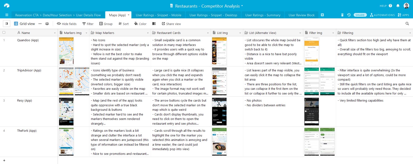
In order to have a better understanding of what our competitors were doing and how we could provide value for our users I conducted a thorough analysis of competitor platforms.
This analysis focused on individual features such as User Ratings and Reviews but also on larger interconnected parts of the funnel such as the reservation and post-booking user journey starting from the reservation CTA button.
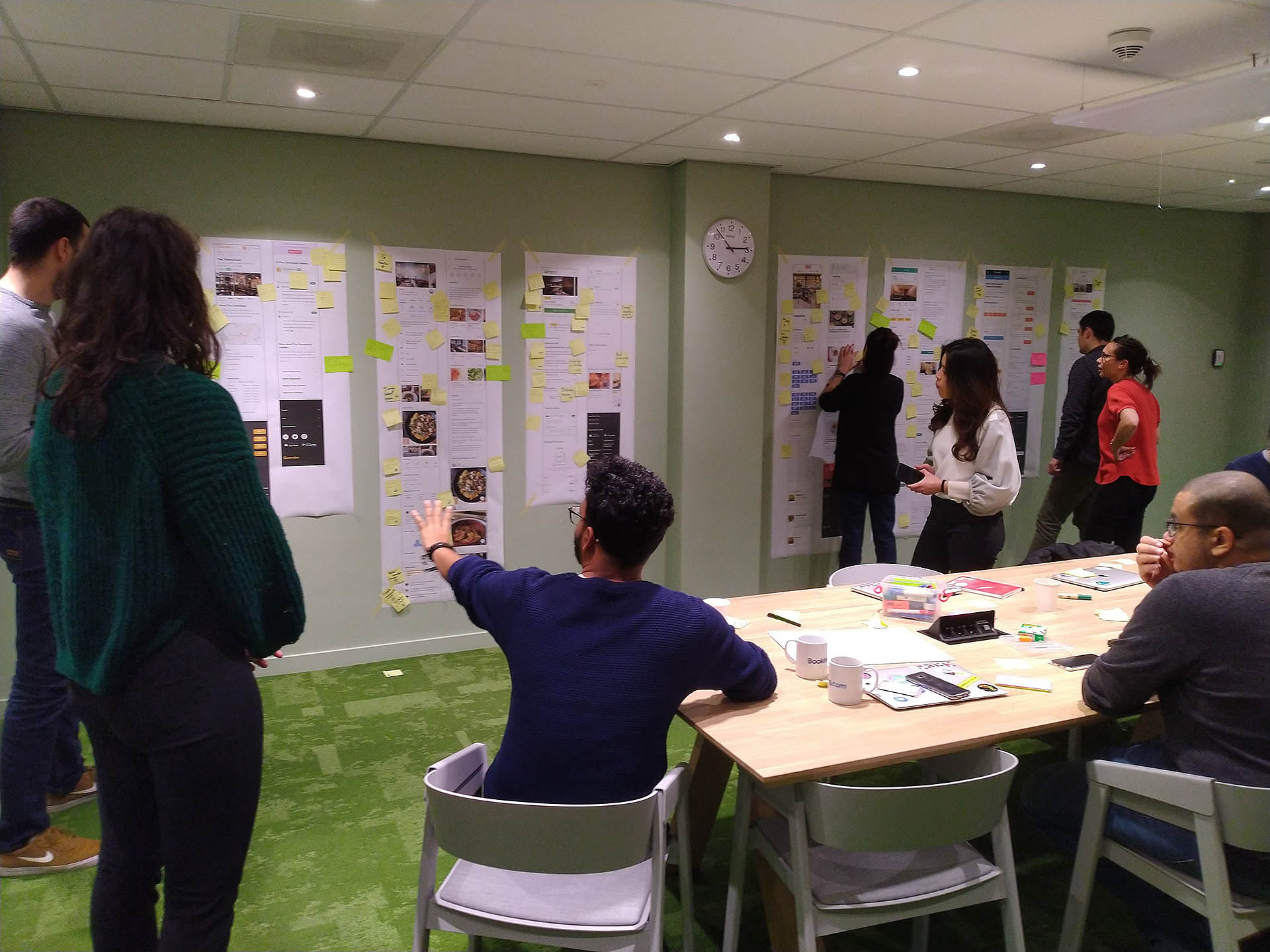
The findings were shared with the team and provided a basis for the Competitor Analysis workshop where we dug deeper into the landing pages of each competitor.
User Journey Analysis
Reservation CTA > Date/Hour Selection > User Details
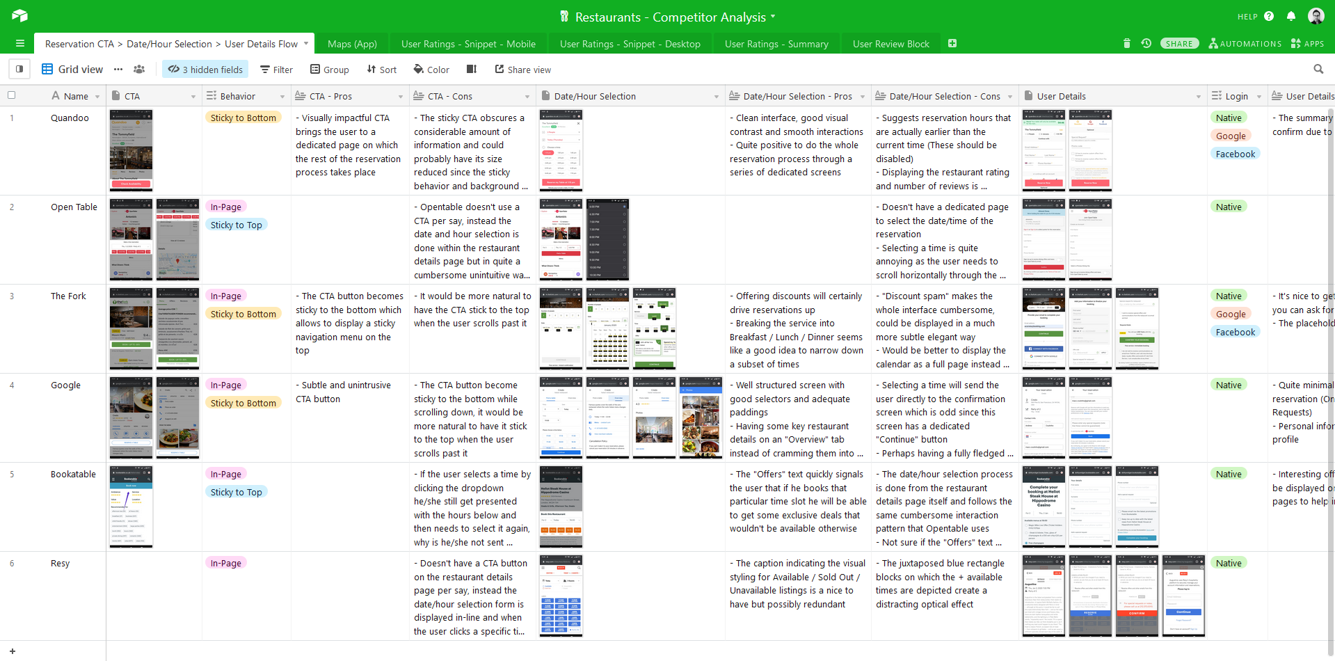
Confirmation Website / Email / SMS
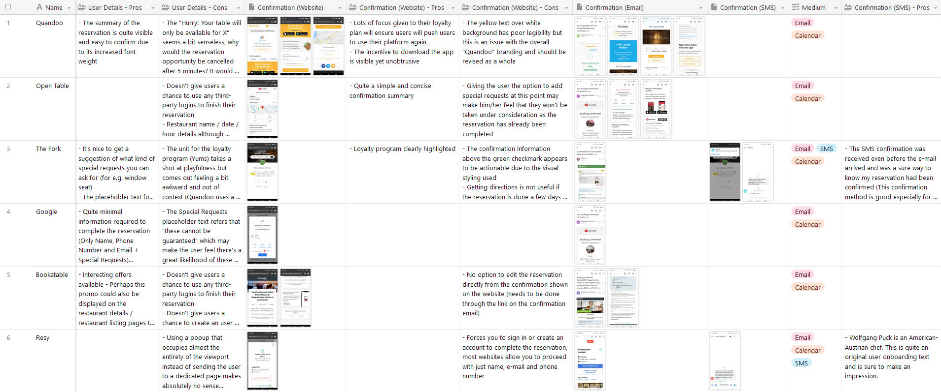
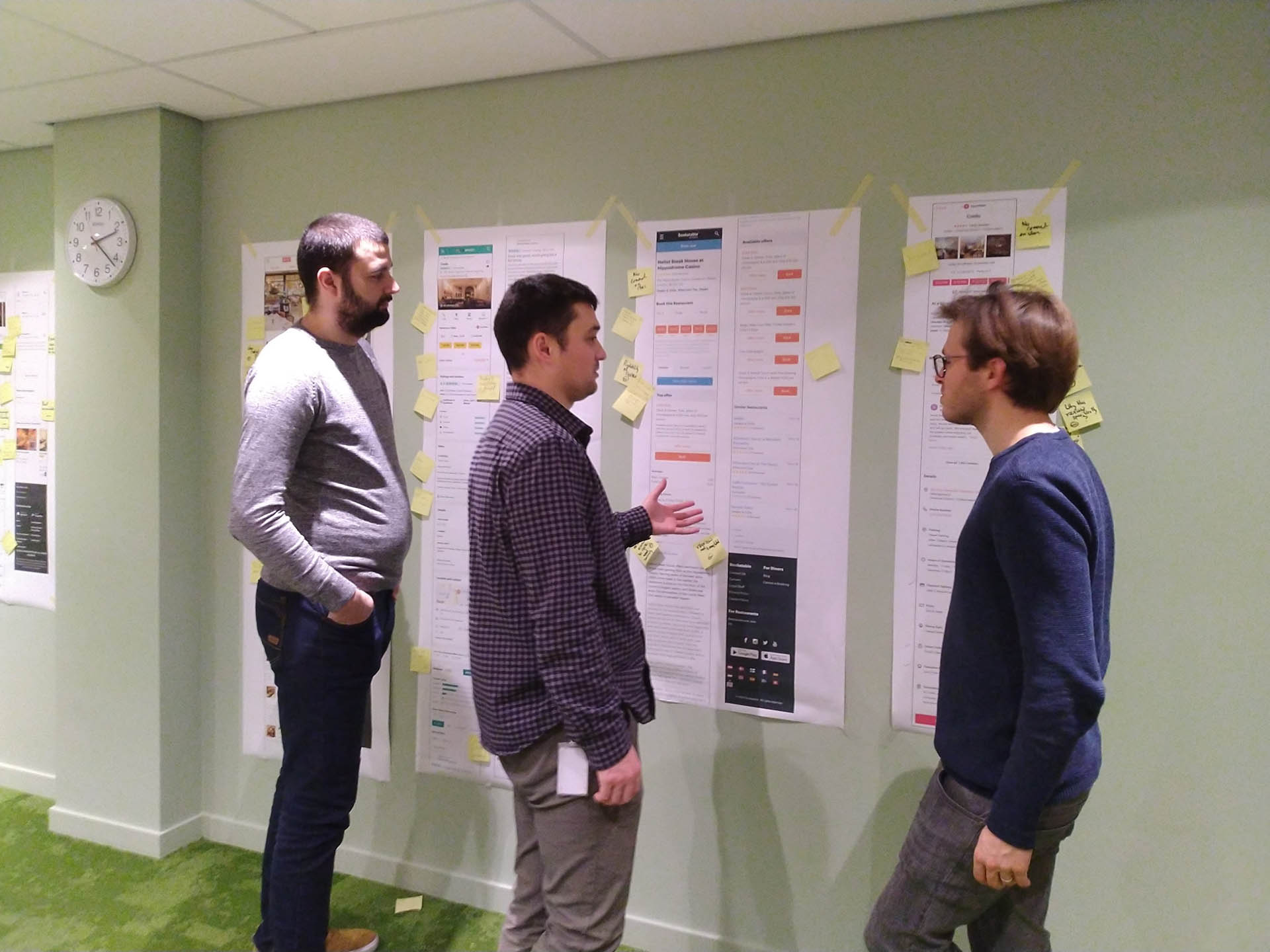
In order to engage the rest of the team and to enrich the competitor analysis with multiple perspectives I facilitated a workshop where we focused on analysing the different elements present on the landing pages of our competitors during a 2-hour session.
I divided the team into groups and each group focused on a specific component on the page across the different competitors. I ensured that each team had one member of UX or Product alongside several developers in order to get a comprehensive overview and different perspectives over the websites analysed.
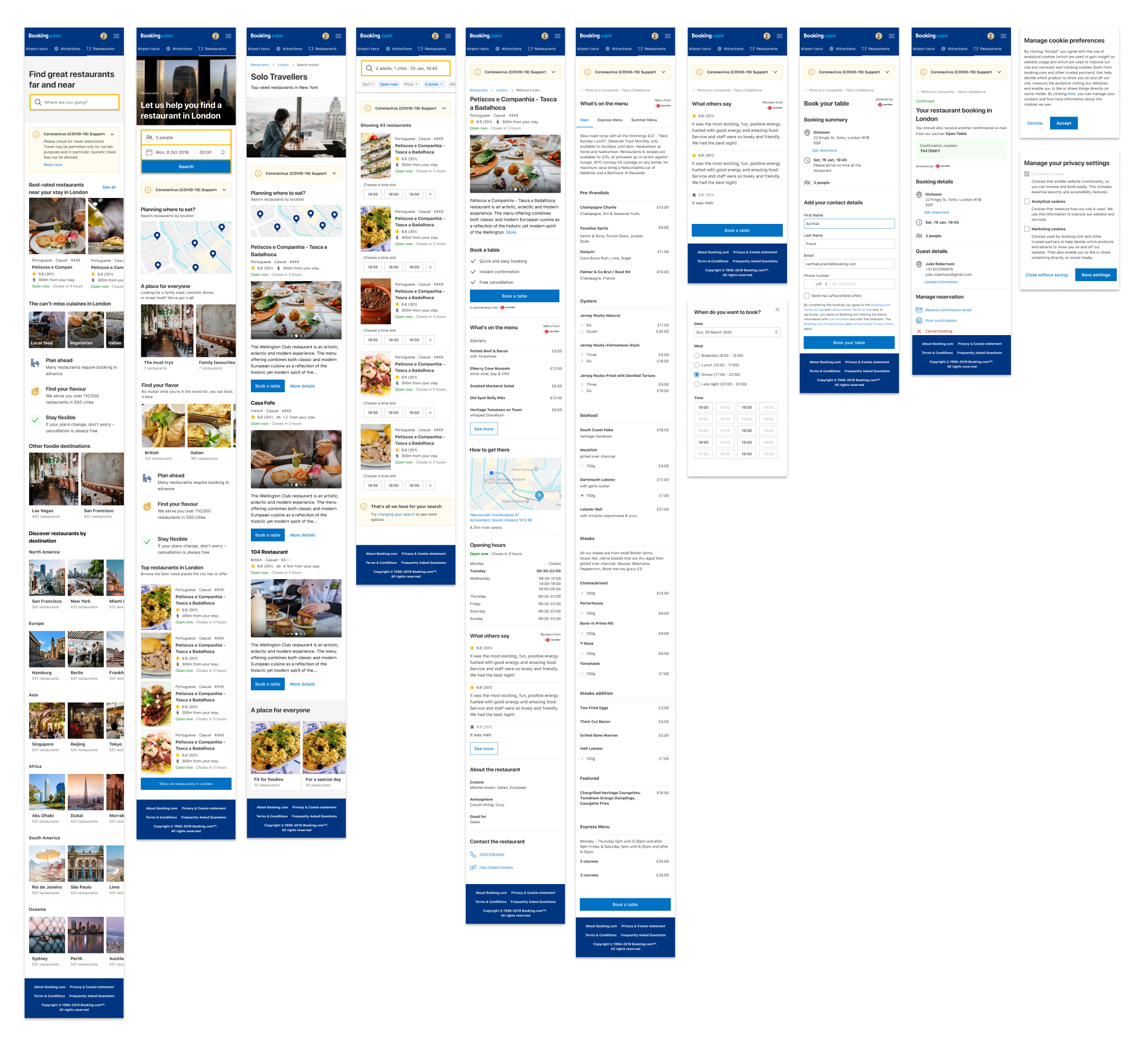
Below you can see the different screens that are part of the full funnel of the platform after we completed the migration to use the Booking User Interface (BUI) design system. This ensured that our platform's look and feel was entirely consistent with that of the Accommodation Business Unit (ABU). Our objective was to provide a seamless experience to our users and to ensure that we fulfilled the prerequisites to have our website displayed on ABU's header and cross-sale components in order to drive additional traffic to our platform.
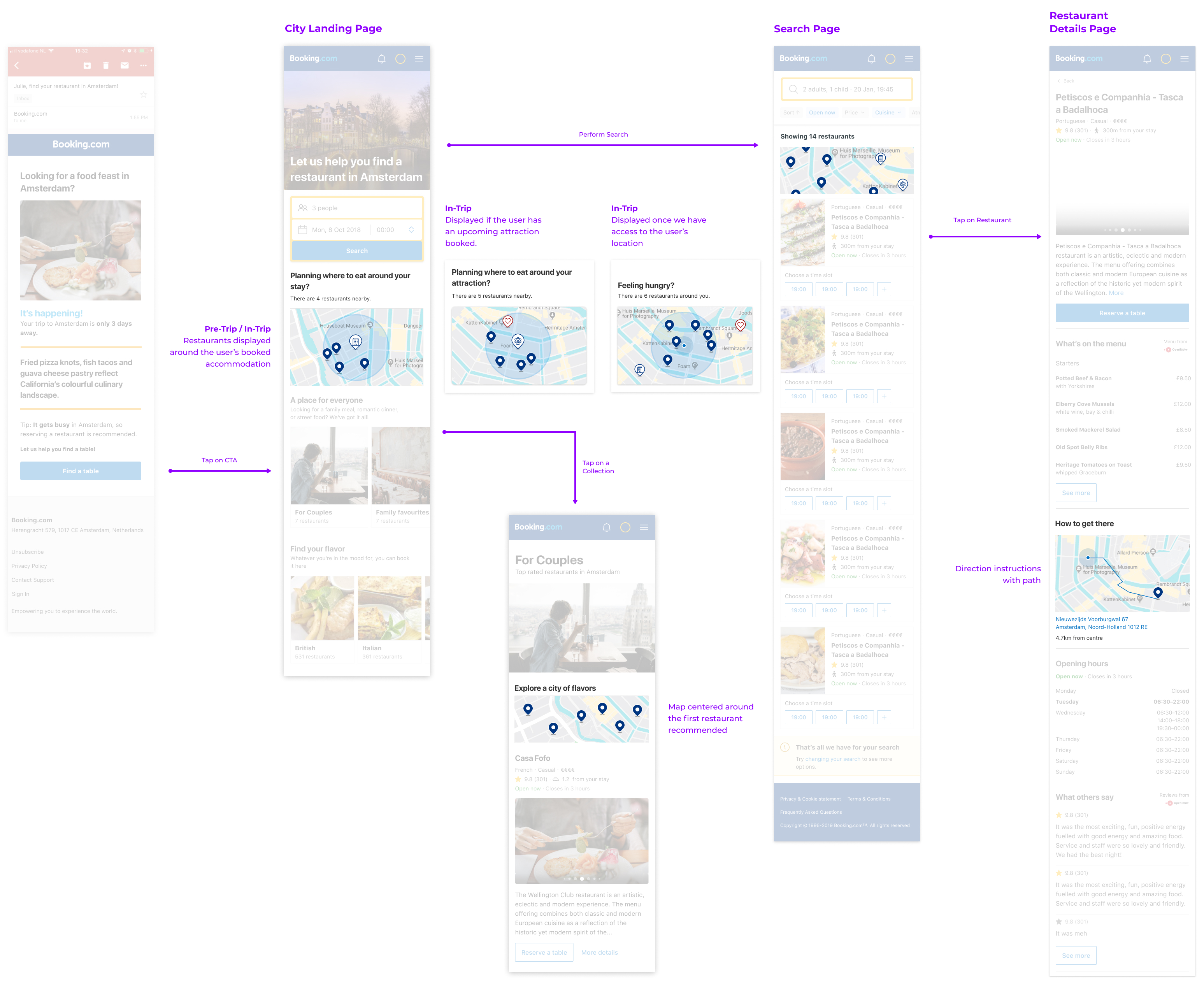
Based on past user research we witnessed that a location based search of restaurants is extremely important for travellers and how finding convenient restaurants could be a focus point for trip planning and in-trip restaurant discovery.
Knowing the users' booked accommodation and attractions in advance would therefore give us the ability to provide our users with restaurant suggestions that are contextual to the areas in which they would travel.
This was also a crucial element that we were missing to achieve competitive parity with other table reservation platforms available on the market.
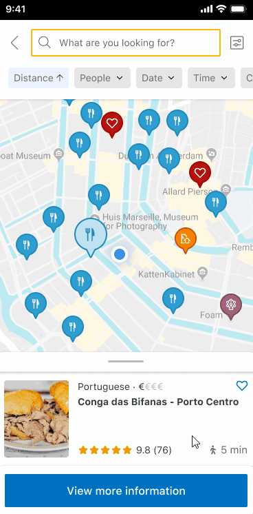
To kick off the project I performed an analysis of the map interfaces present in competitor's platforms and paid special attention to the markers used, the information displayed on the cards and how smooth the overall interaction with the map was.
I analysed the entirety of our platform and pinpointed the different pages where we should add entry points for the map interface and what should be displayed on those snippets.
An important consideration was that users want to see a map snippet that resembles the state of the full screen map itself and they want to see markers that are contextual to their trip.
For example, on the city landing page the map snippet would display suggestions around the user's location or, if that is unknown, around the user's next booked attraction or accommodation.
Scrollable List
Note: These prototypes still use custom created markers, we later on decided to use the standard BUI markers to achieve greater design consistency between our product and the accommodation's website.
The first concept featured a scrollable list that would display all the restaurants in view on the map.
If the user clicked on a marker the list would automatically scroll to that entry and the "View more information" CTA could be clicked to access the additional details of the restaurant and book the table.
This would render the actual list view unnecessary but it had the drawback of the list reflecting only the restaurants in view of the map and not the whole supply of the city.
Swipable Cards
On the second concept I decided to keep the list view so that we could expose users to the full supply of a given city.
The user would then click through to the map view and could either click the markers on the map to automatically swipe the cards or swipe them manually to highlight the markers on the map.
I also added time slots contextual to the users to the cards themselves so that they could immediately click it to book a table for that time.
On both concepts I removed the scrolling animation of the cards when the user clicks the markers on the map as this is detrimental to user experience.
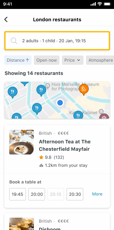
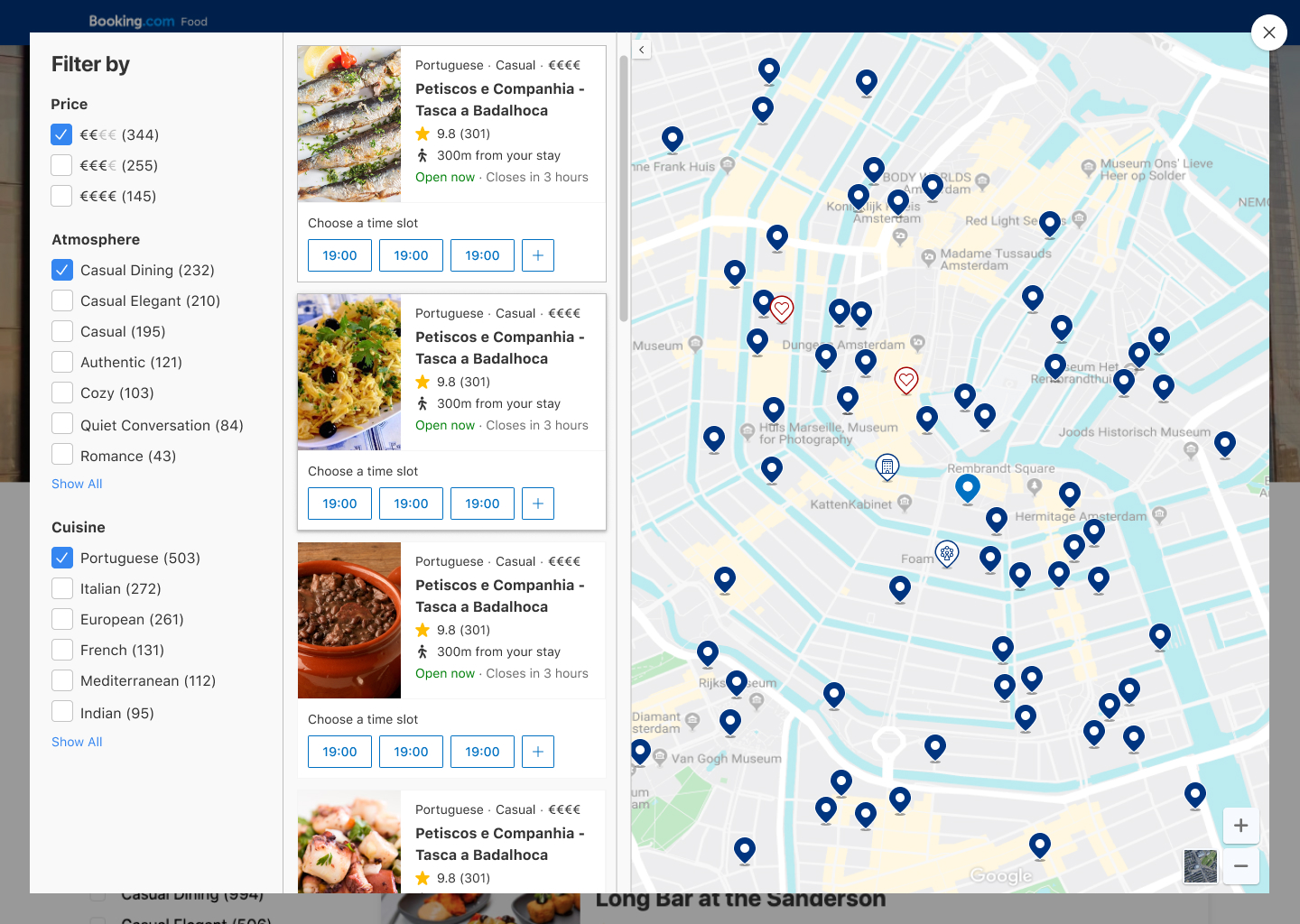
The map on desktop would be displayed alongside a list of restaurant cards.
These cards would reflect the markers shown on the map and update automatically when the user pans or zooms.
The filters are also included to allow the users to quickly narrow down the restaurants based on their preferences without having to go back to the underlying restaurant list page.
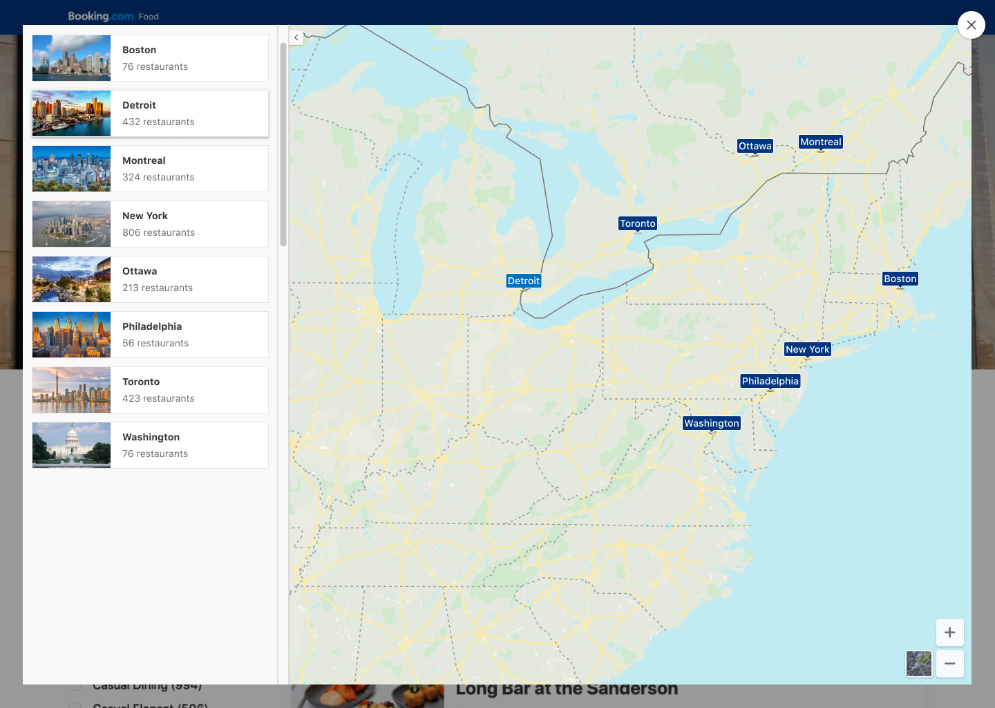
Since our website was broken up into city landing pages you would only be able to see results on the map for the city you would have previously selected.
As this would result in a strange experience for users looking to book multi-destination trips we wanted to support city selection if the user would zoom out past a certain point.
Initially search had been envisioned based on availability, the users would select the time and date for which they would like to reserve a table and simply filter through the results to narrow the results down.
We wanted to improve this and to allow users to re-discover our supply by using a free text search and providing meaningful type ahead suggestions based on restaurant names, street names, POIs and more.
Choice overload was a known issue for our breadth of selection. Allowing users to get relevant results to their context by querying directly from the main search bar is a best practice and important for feature / competitive parity.
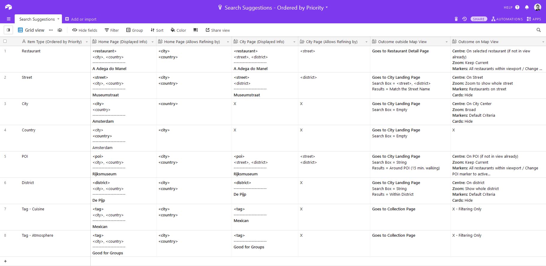
First it was important to define the logic of the search suggestions shown so that we could use the slots available to provide a good range of type ahead hypothesis for the users.
For each suggestion I defined what additional metadata would be shown and added examples of the formatting. I also defined what would be the outcome if a given suggestion type was clicked on the list view vs. the map view.
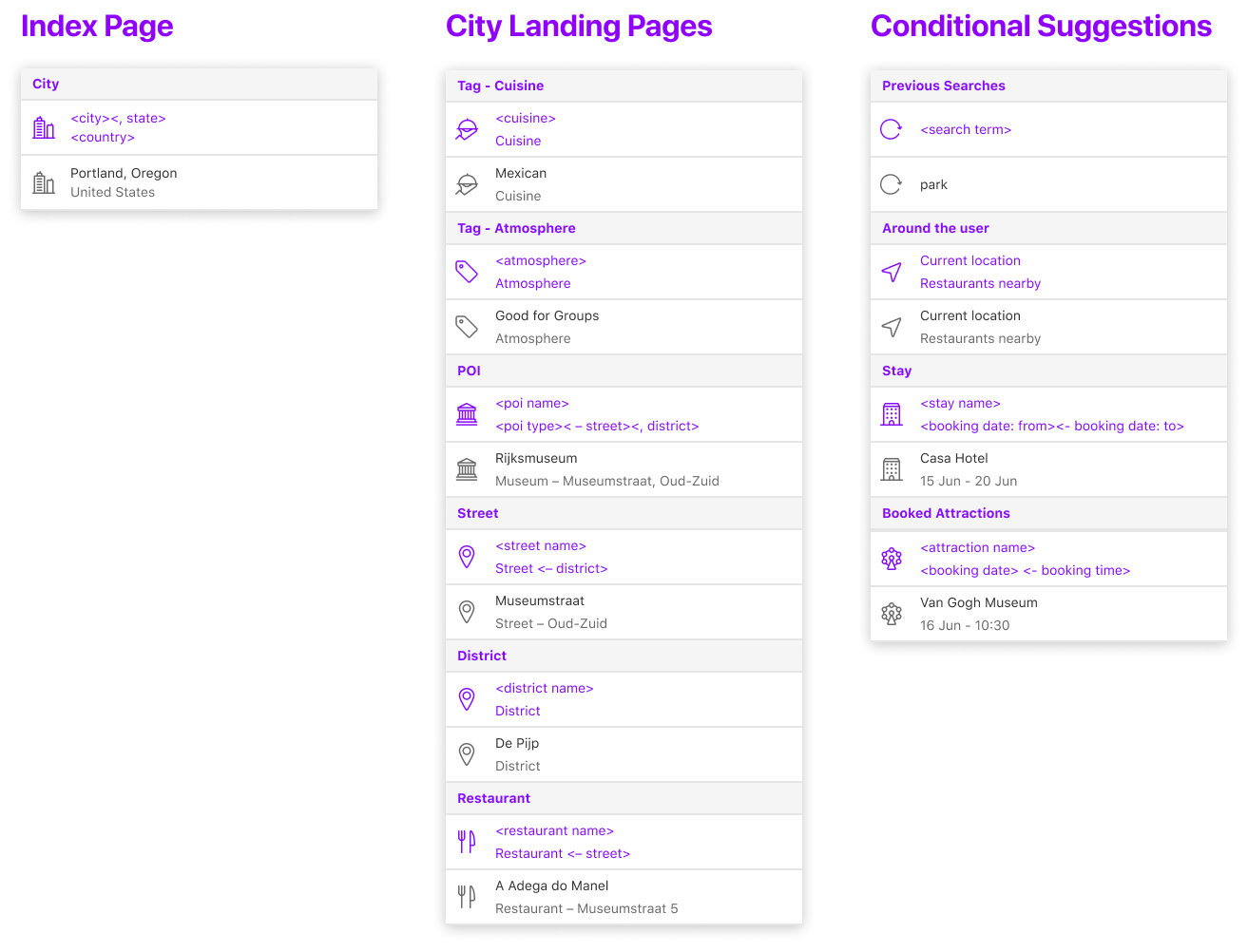
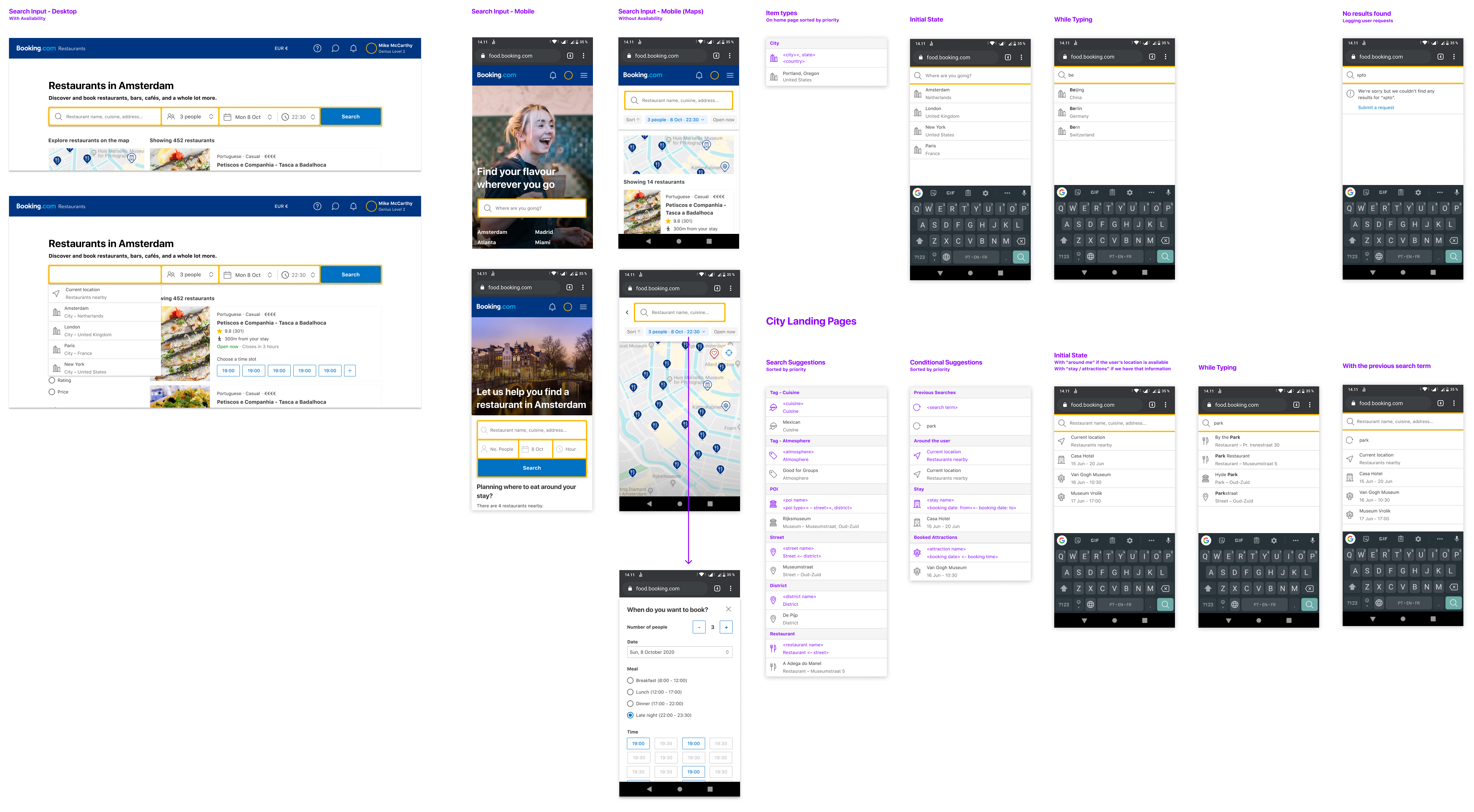
On the designs below you can see both the desktop and the mobile designs for the search input as well as a complete overview of the different type ahead suggestions. There are also some examples of what would be the initial suggestions shown.
Based on our objectives for 2020 to increase exposure and expand coverage we found it necessary to have more granular control over the restaurant entries supplied to us and to create a framework from which we could tweak metadata in order to ensure supply quality.
The back office was created with these user groups in mind:
Editors - Moderate, edit and create content within the supply catalog.
Product - Responsible for the clients consuming our supply.
Developers - Work on partner integrations and supply quality improvements.
This allowed us to modify content visibility, monitor supply quality, enrich content and to abide to legal requirements for transparency on supply regulation, content ownership and moderation flows.
The back office was a place where three main things were managed:
Partner Integrations - View and edit the mapping of partner integrations to our taxonomy.
Catalog - Search, view, create, edit (this will override the partner ingested version) and reset (to the latest partner ingested version) any content inside our catalog.
Clients - Customize and change the access of clients to our catalog and its content.
Breakdown
To assess what would be the main sections of the back office I organized a brainstorming session to which both the UX and Product teams were invited.
The individual features were then listed and prioritized according to how highly they had been voted during the brainstorm.
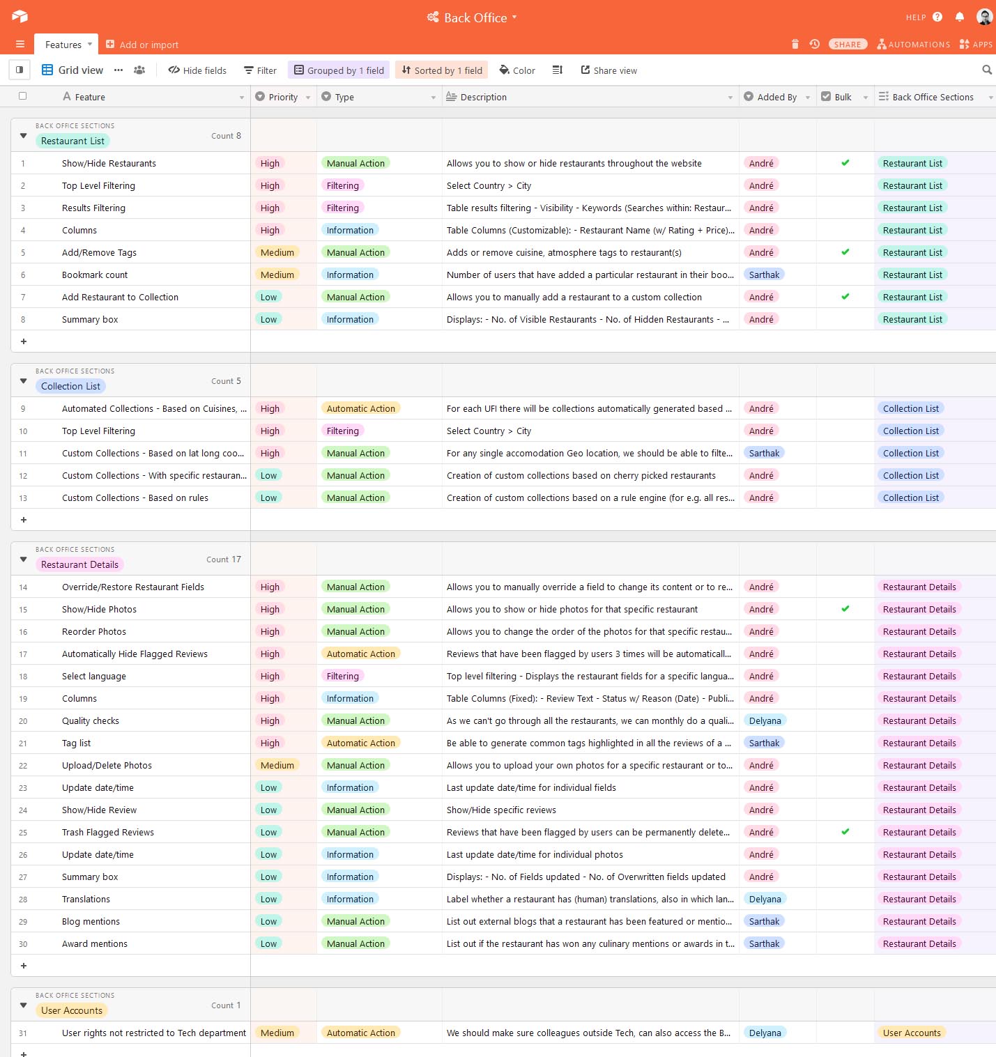
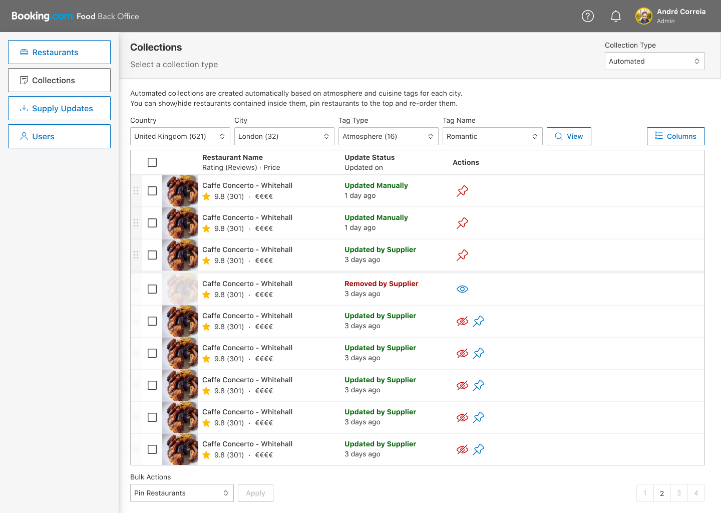
The restaurant list view would display several characteristics of the restaurant by default and allow you to show / hide additional properties through the "Columns" menu.
Since our restaurants were fed to our system from external suppliers the update status would display important information about when a given restaurant had been last updated and if supplier updates would conflict with manual overrides to specific fields done by us.
You would be able to hide restaurants from being displayed on the website completely if we felt they lacked quality.
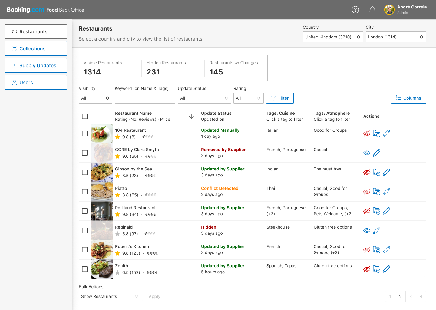
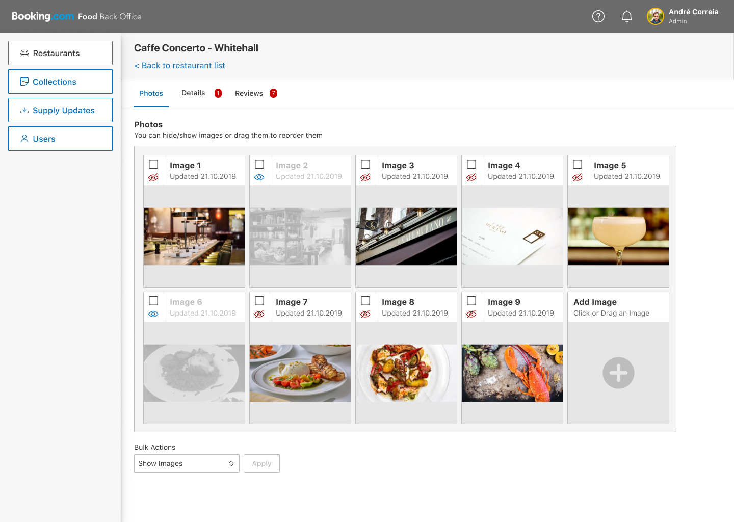
Photo quality was something we were extremely concerned about since we had encountered several instances in the past where the main photo for a restaurant would lack quality or would display for e.g. a toilet.
This feature would allow us to reorder photos or to hide photos completely from showing under the restaurant entry in order to improve the overall quality of the photos displayed on the website.
Food is an extremely visual product so this was a feature of the utmost importance for us and on the top of the list of priorities for the back office development.
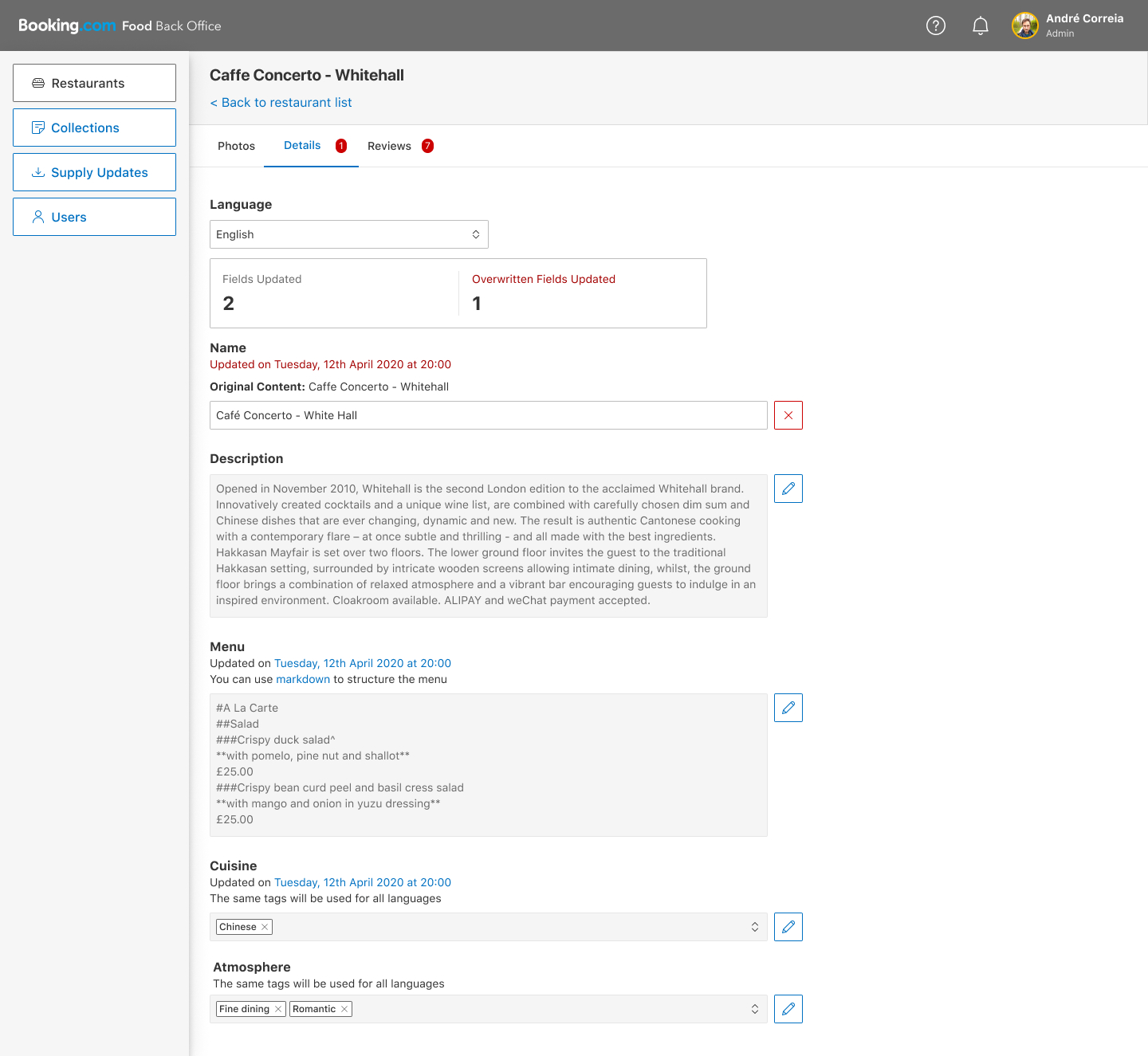
On the details page of a restaurant you would be able to override specific fields in order to edit the information being given to us by our suppliers.
After you would update a field you would still be able to see its original content so you could compare the original content with the overwritten one.
From the overview page you would be able to see if the last supplier update would have tried to push changes that conflict with your own and come to this page in order to solve the issues.
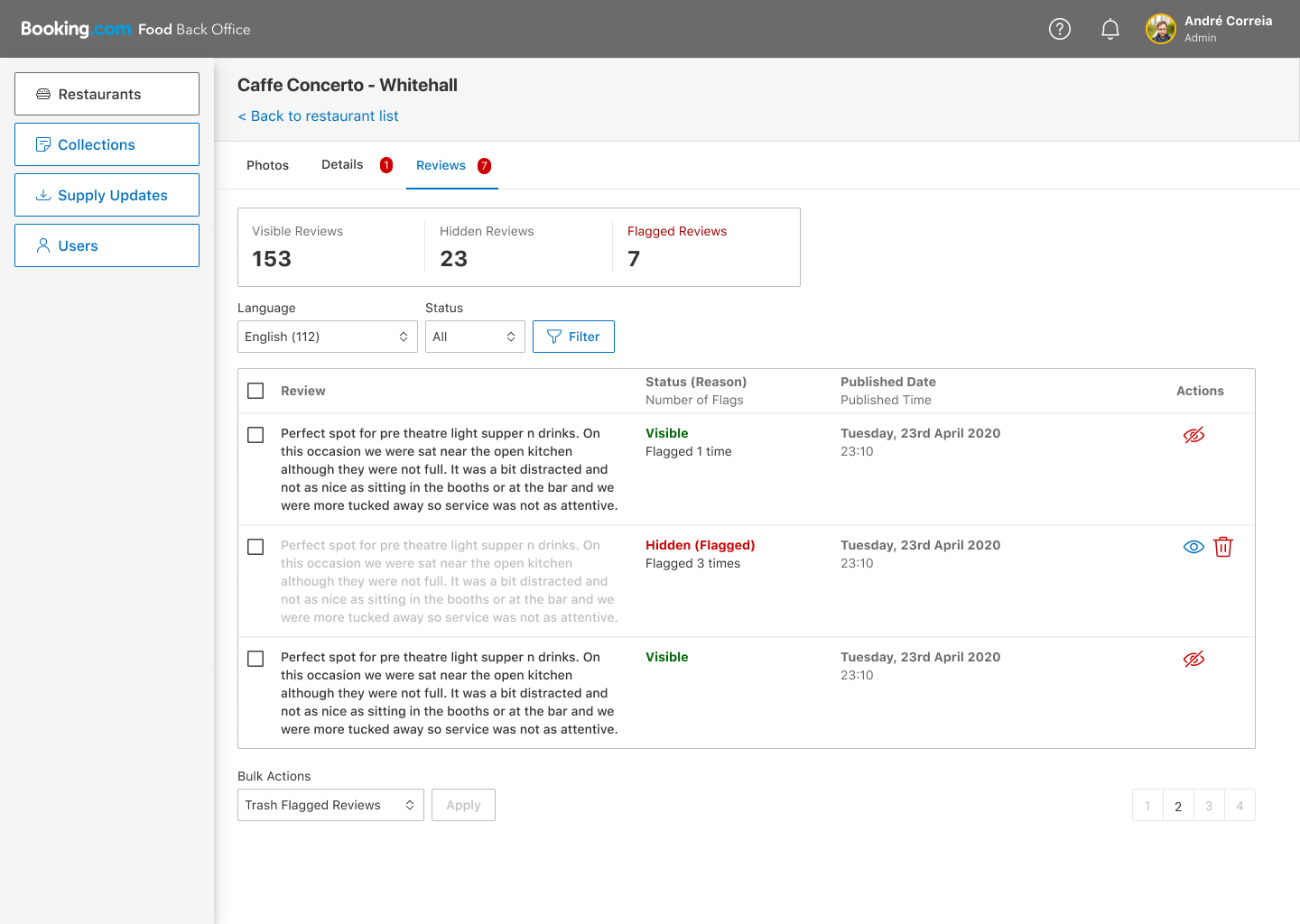
Reviews would be shown by default but users would have the ability to flag them. If a review received 3 flags it would be hidden and marked for moderation, we would then review it and decide if we should show it or if it should be permanently deleted.
After we had integrated with the global login system we would have additional information regarding who posted a specific review and the ability to ban users that consistently posted abusive reviews.
Our collections were automatically generated based on cuisine or atmosphere tags parsed from the suppliers and sorted based on our internal rating score.
Still we wanted to be able to hide or show specific restaurants within each collection and also to pin a set of restaurants in order to highlight them to users.